Brand Archetypes

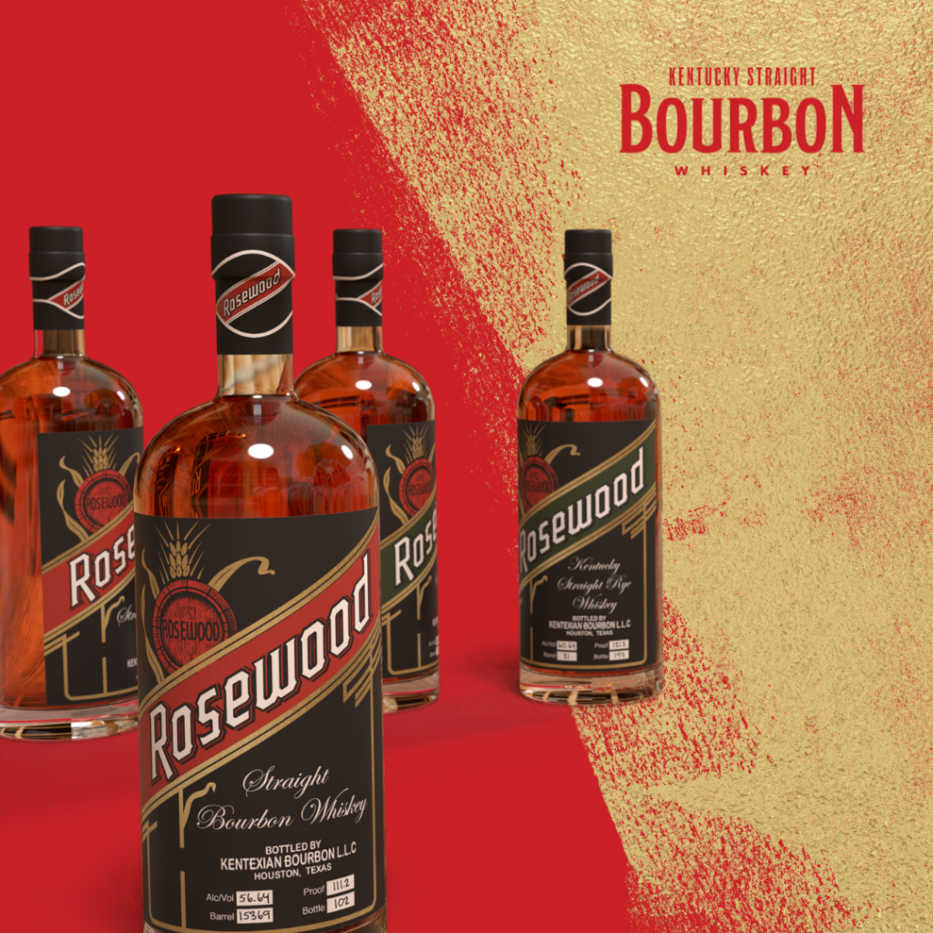
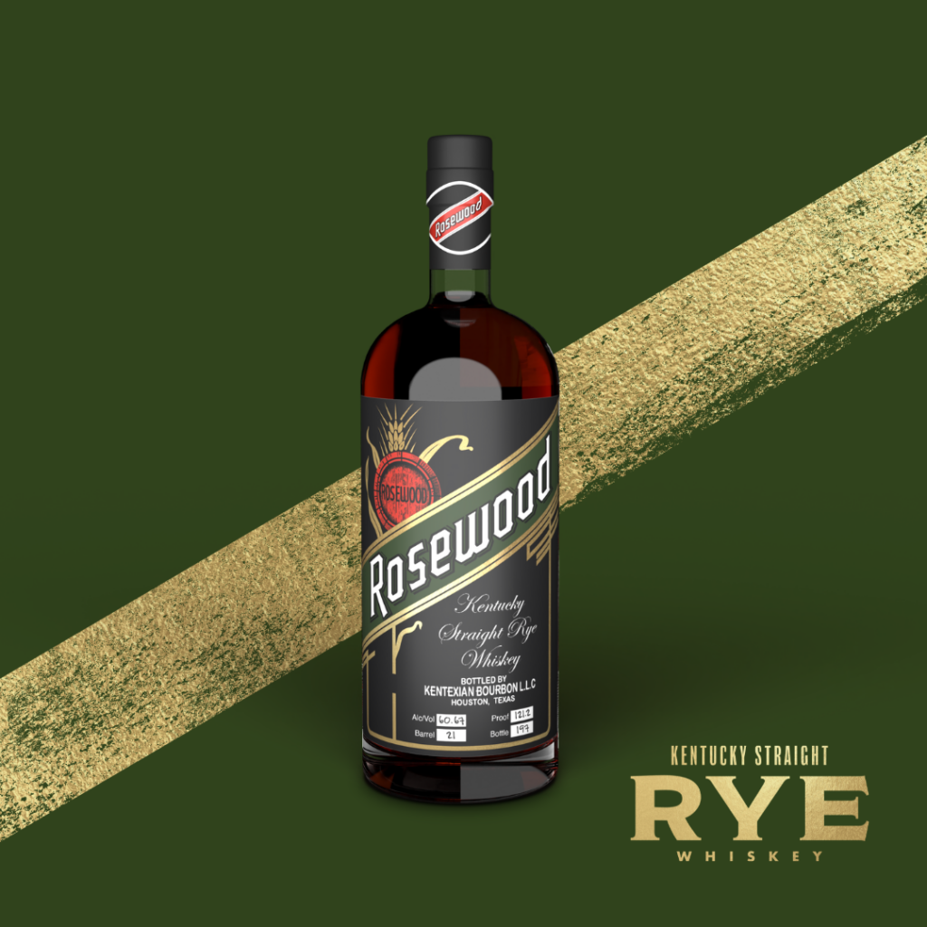
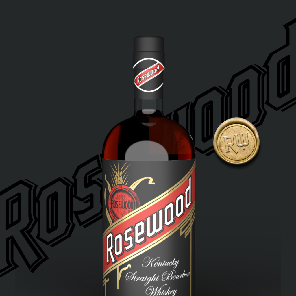
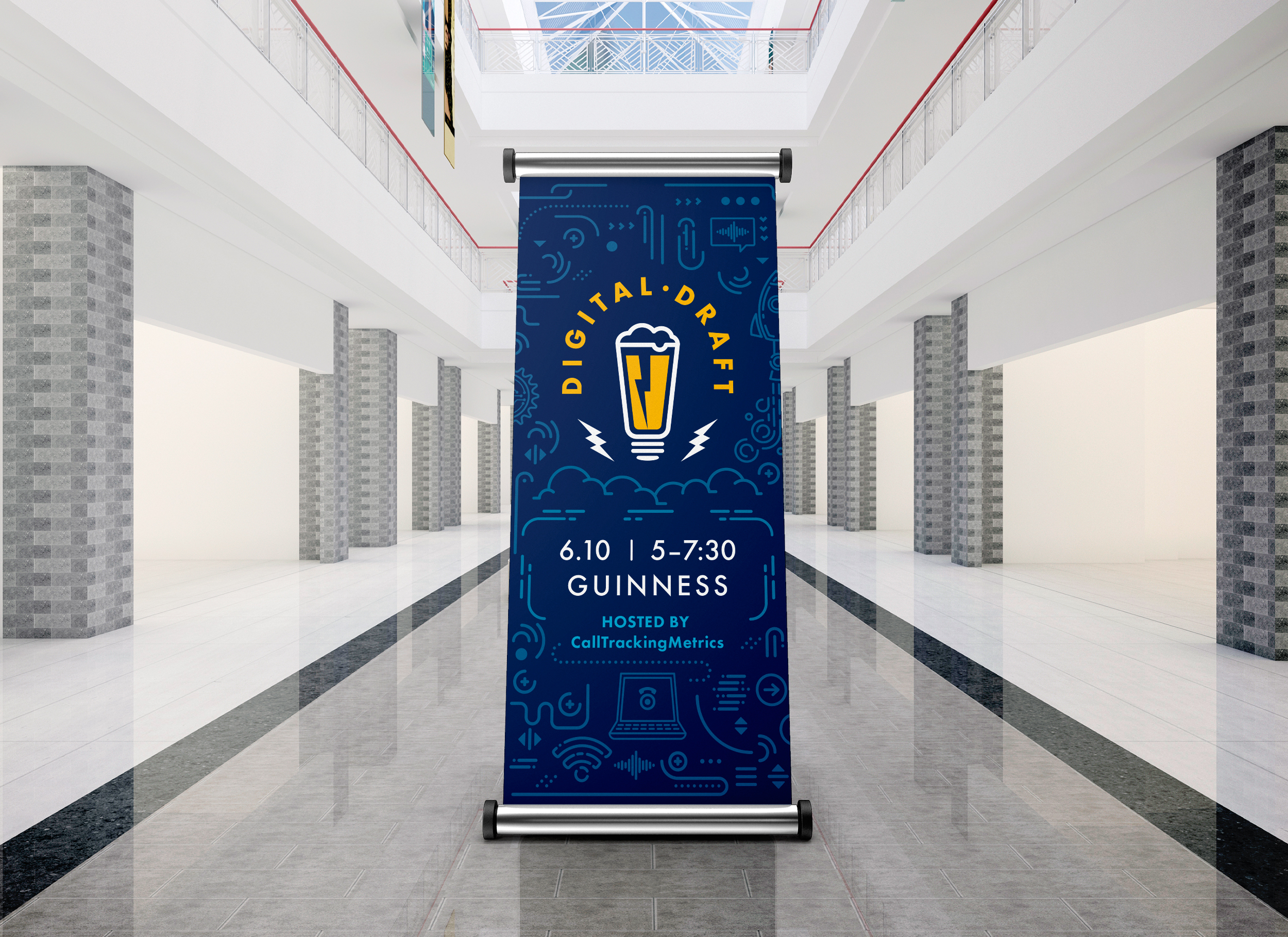
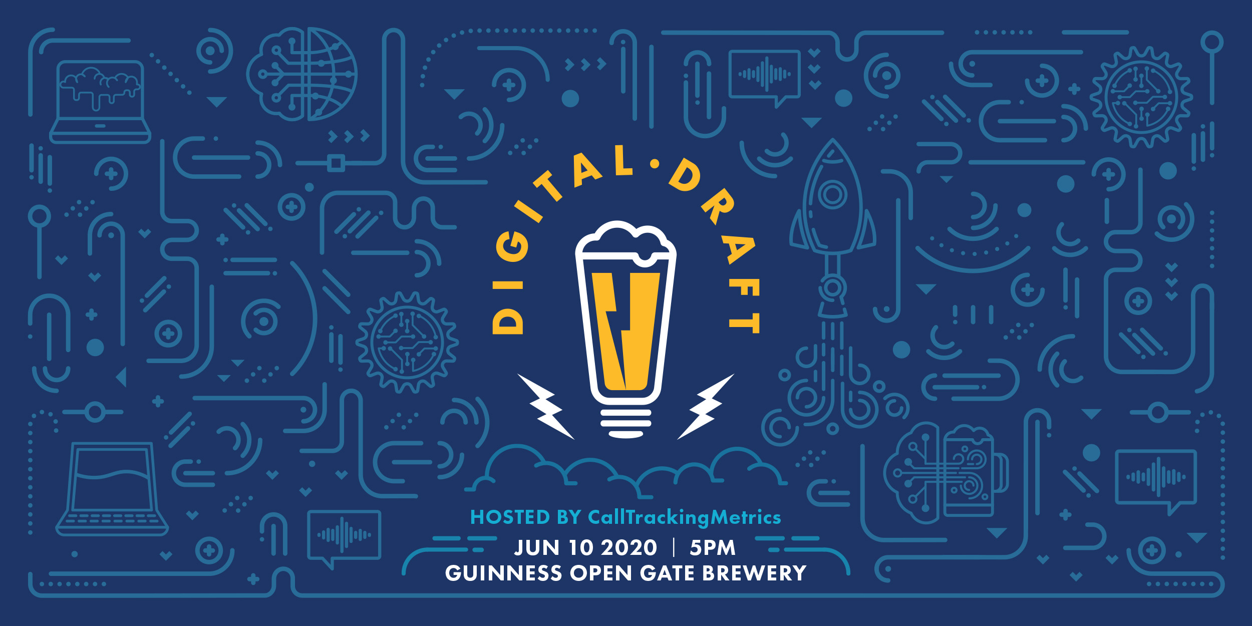
Through the Lens of Popular Alcohol Brands
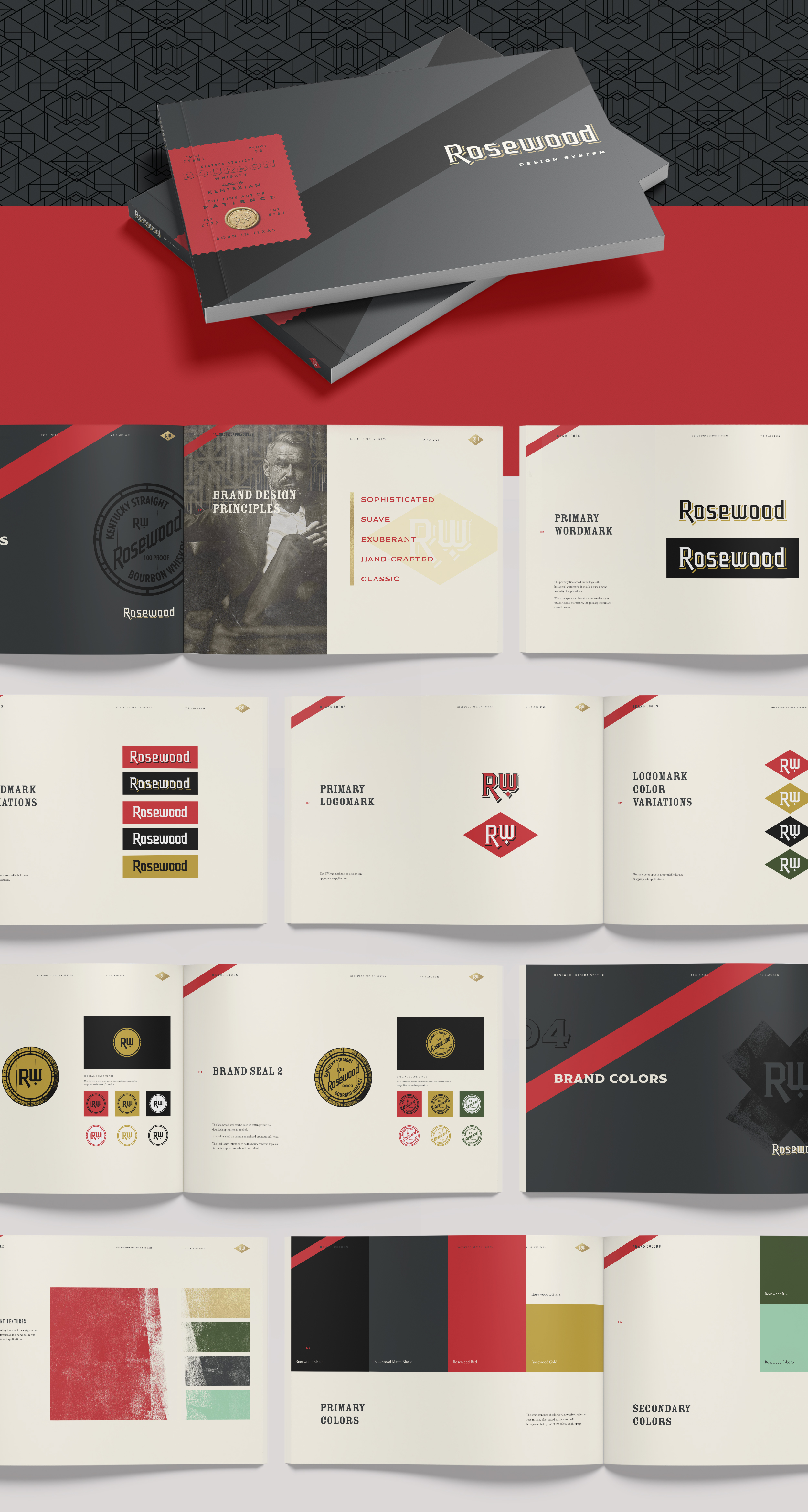

Concept & Design

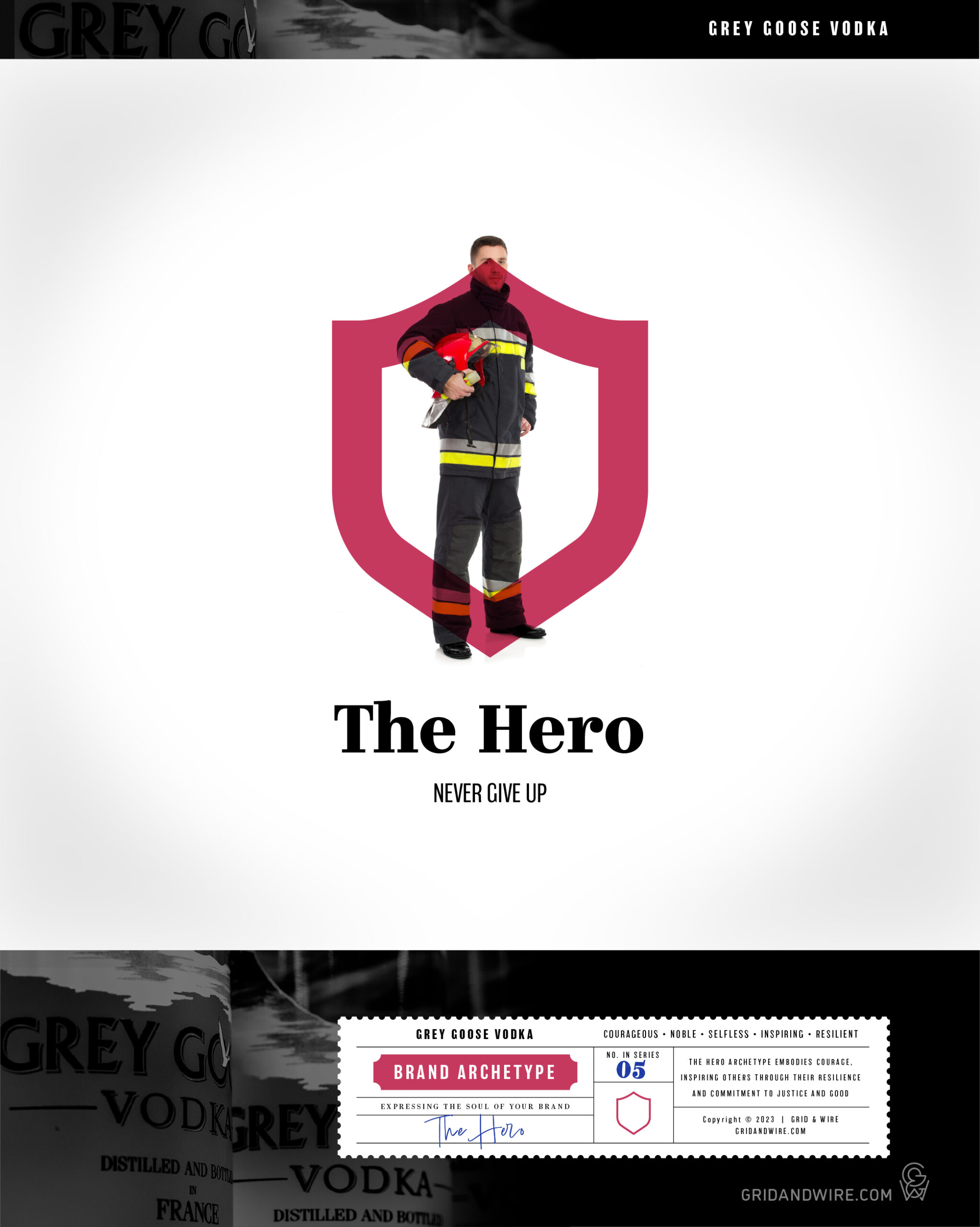
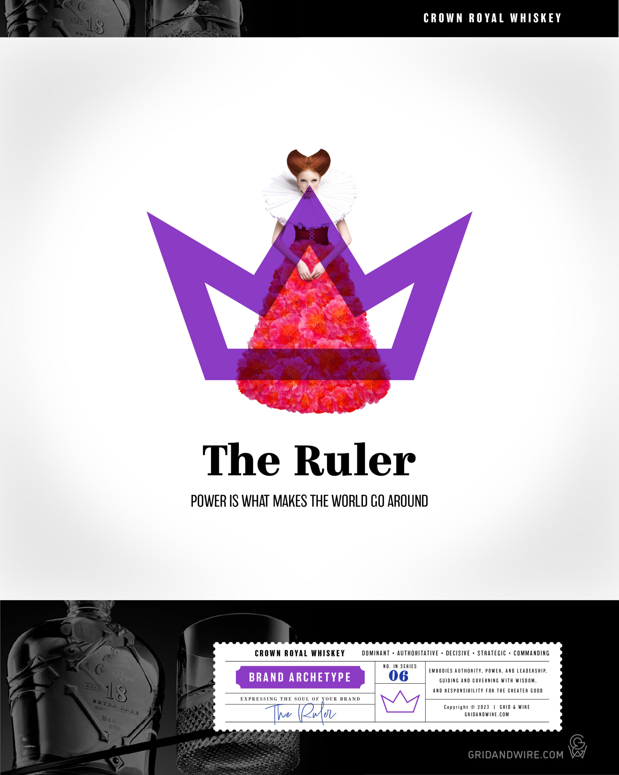
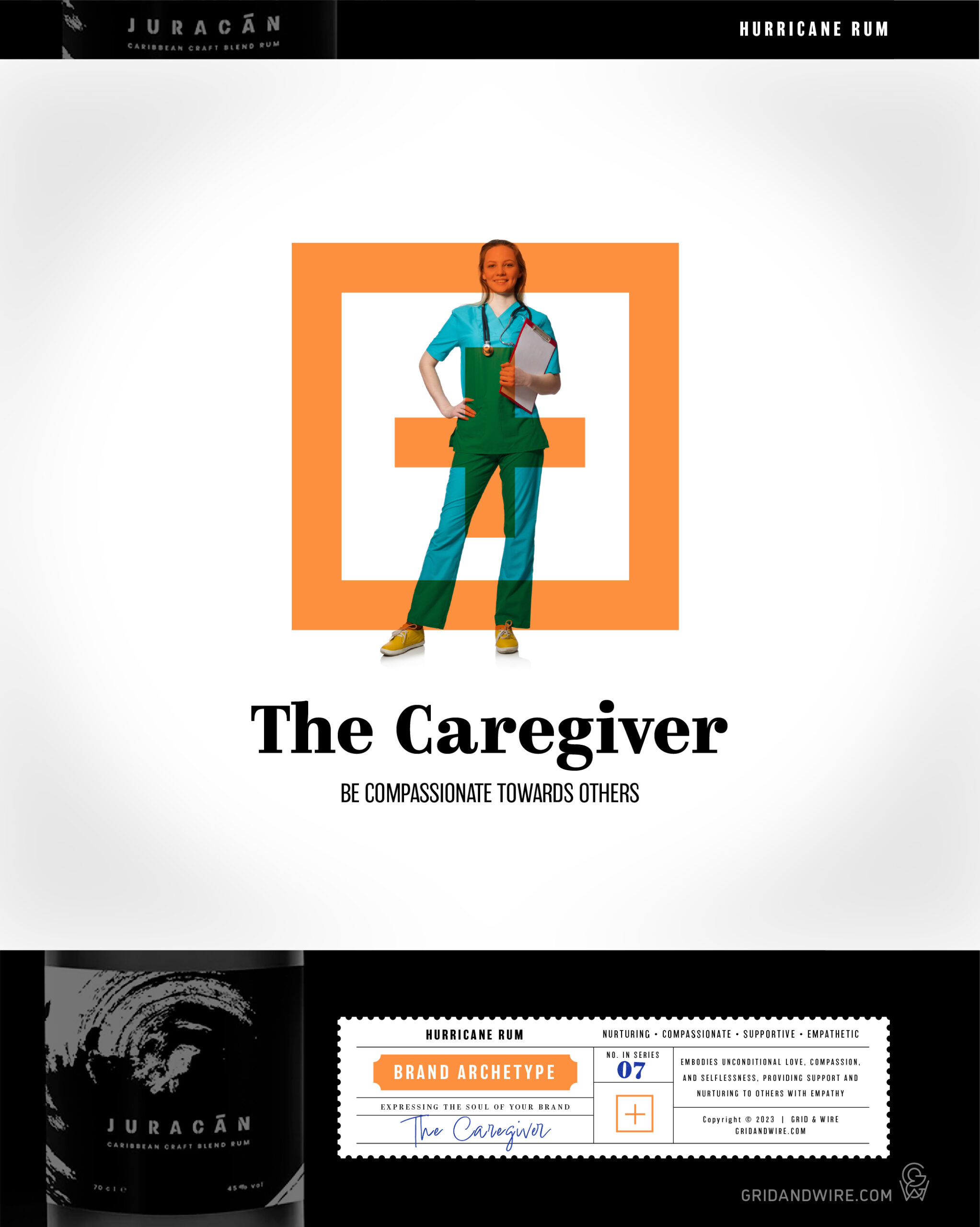
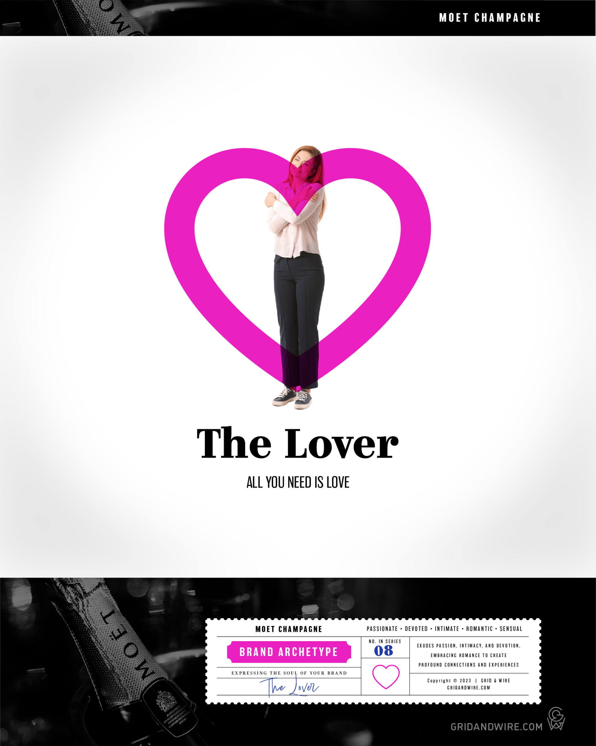
A Swiss psychologist named Carl Jung came up with a set of common personality archetypes in the 1940s that represented model traits among different people. These traits play a role in affecting our behavior on a subconscious level which in turn lead to specific desires, patterns and motivations. In Jung’s theories of the collective unconscious, these archetype roles include Maiden, Self, Trickster, Anima, Animus, Shadow, Father, Mother, Child, Wise Old Man, Hero, and Persona.

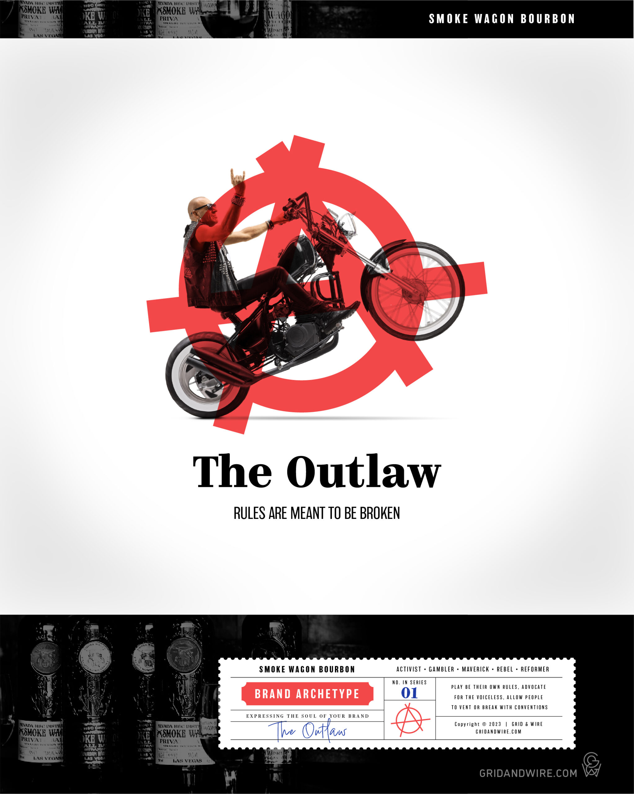
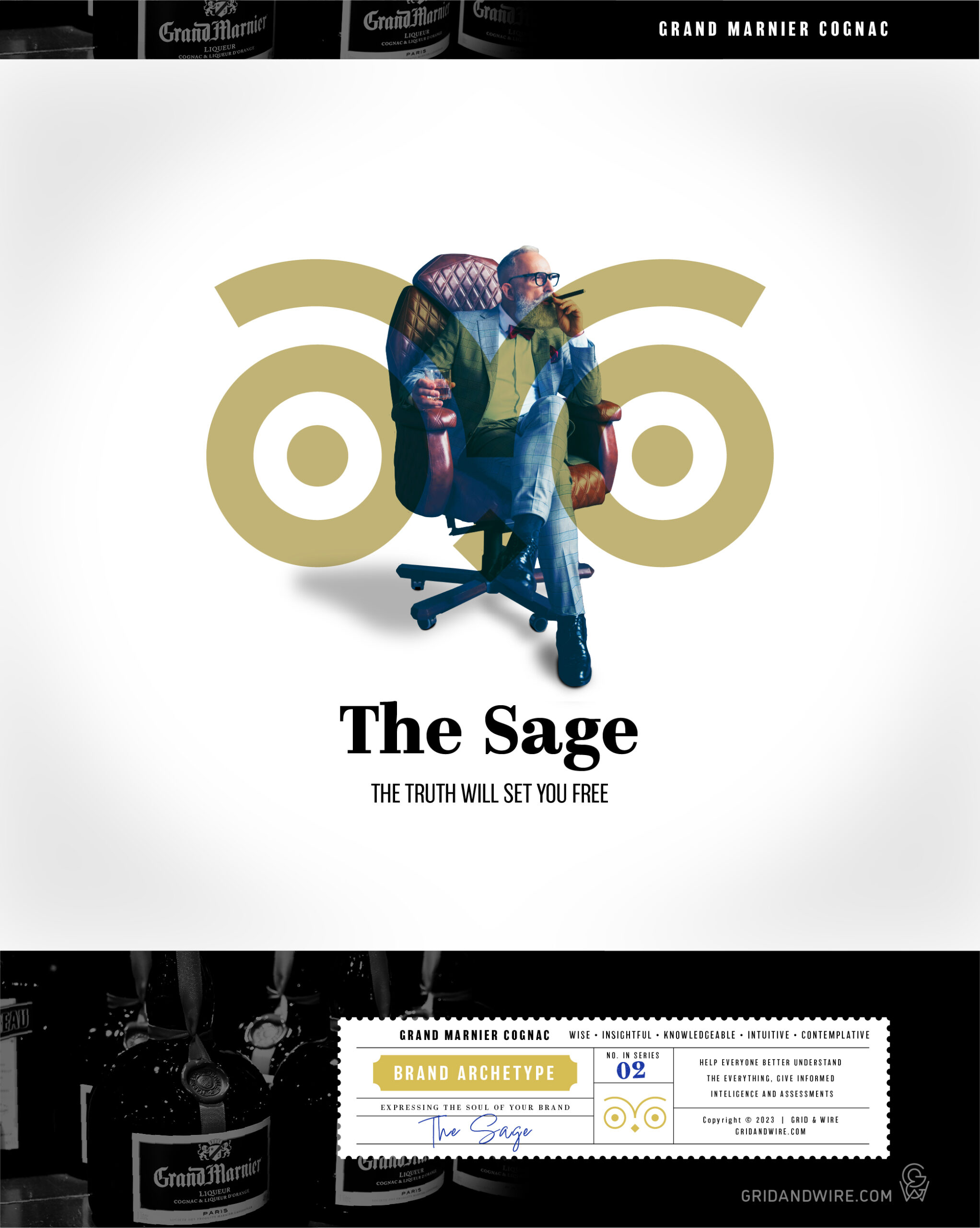
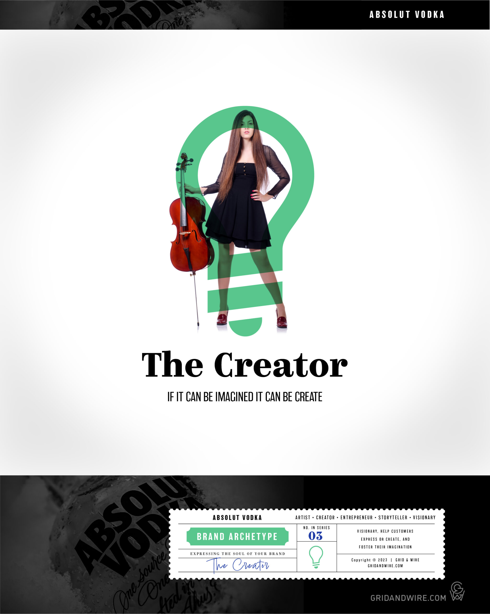
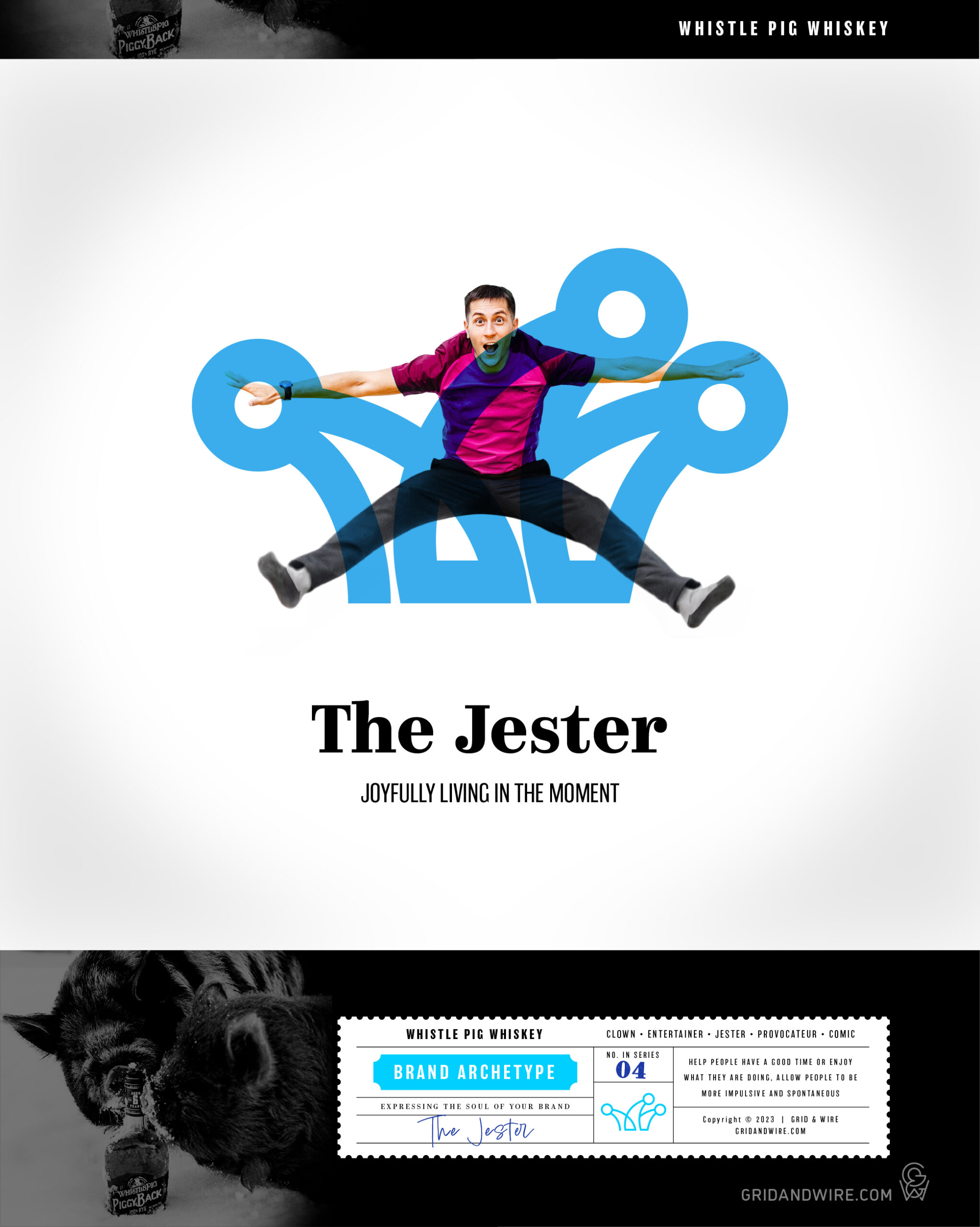
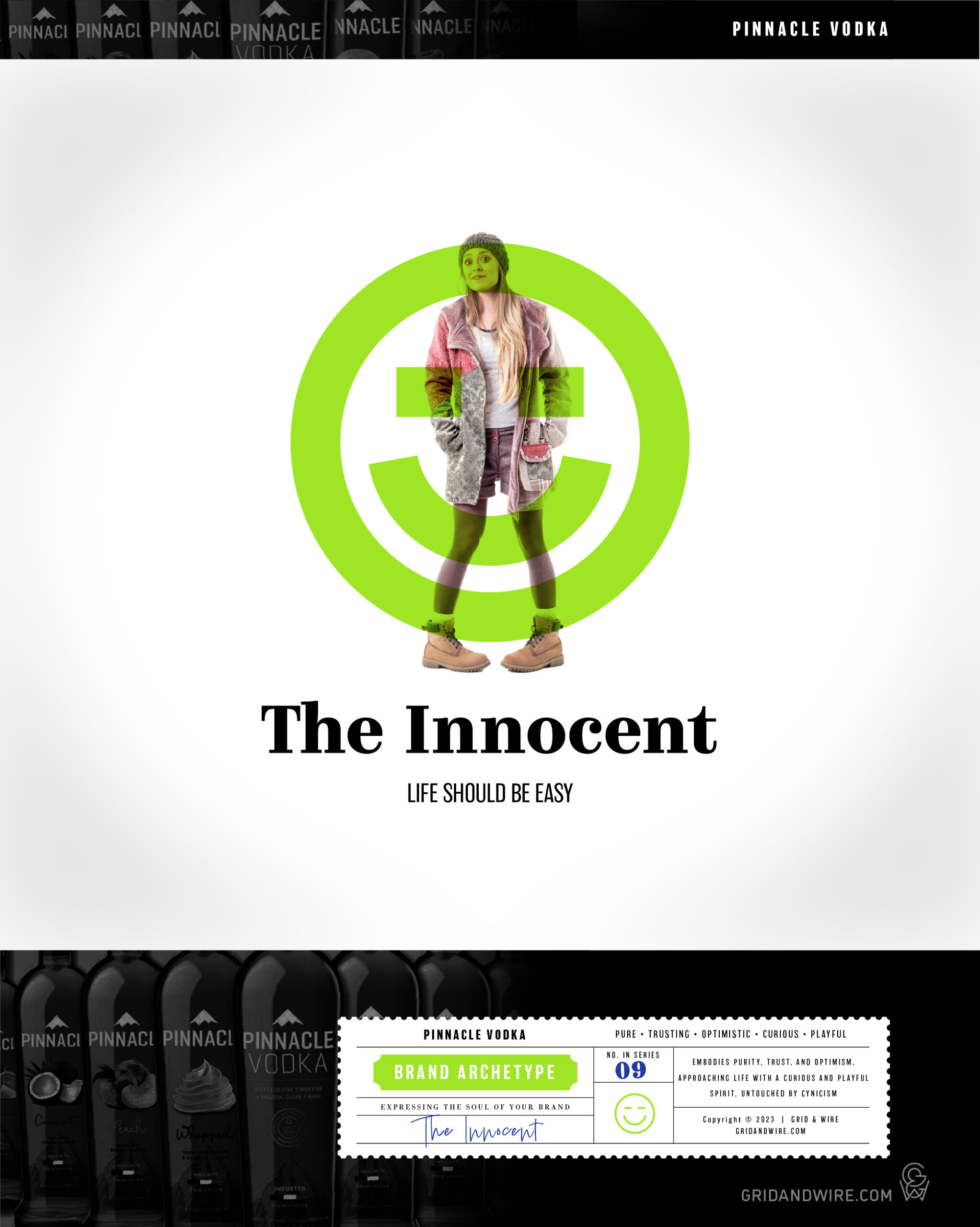
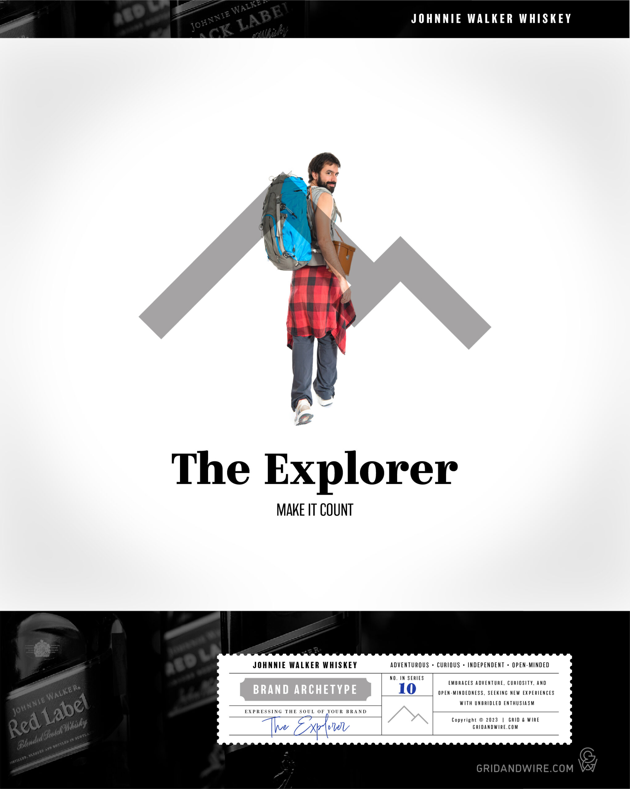
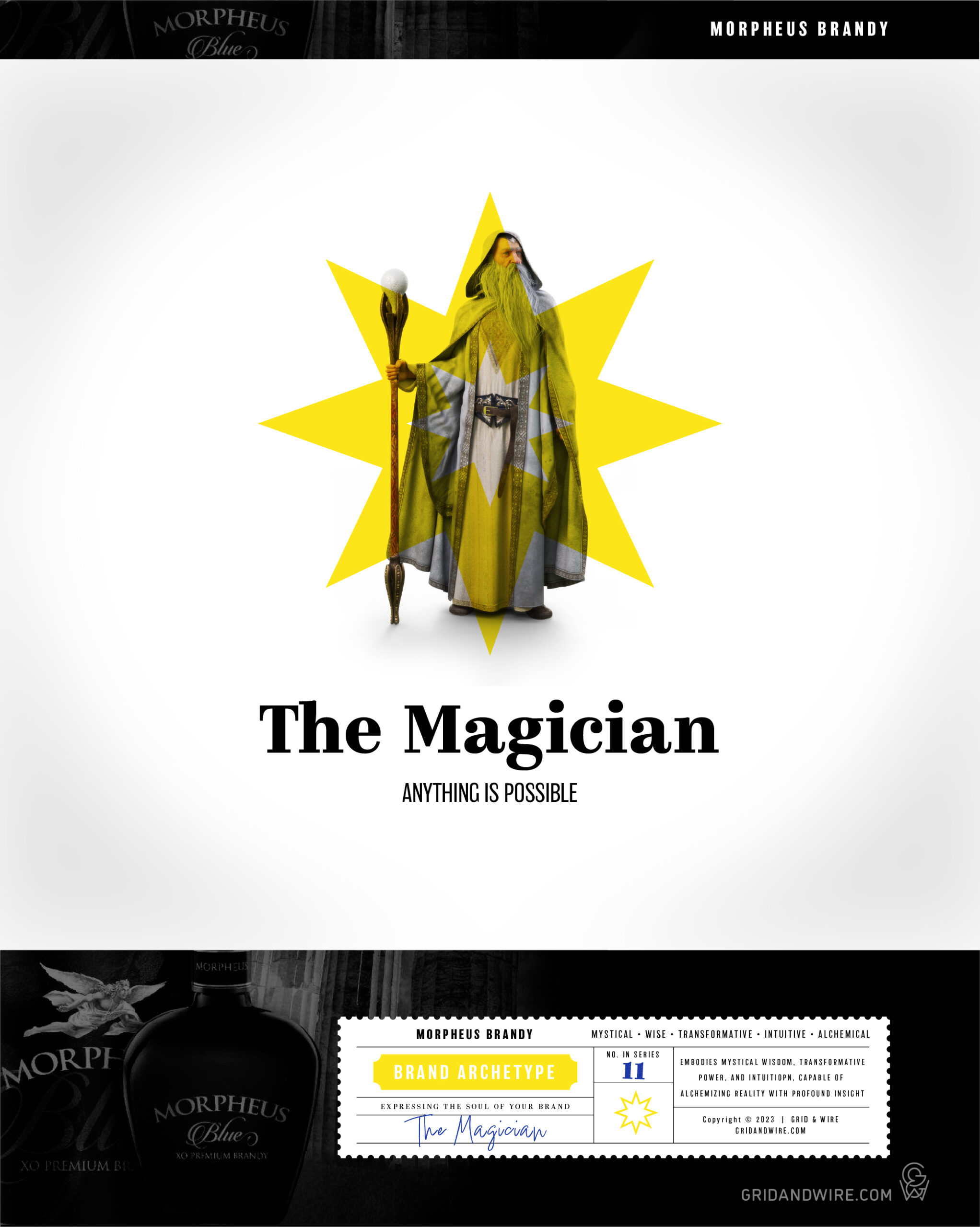
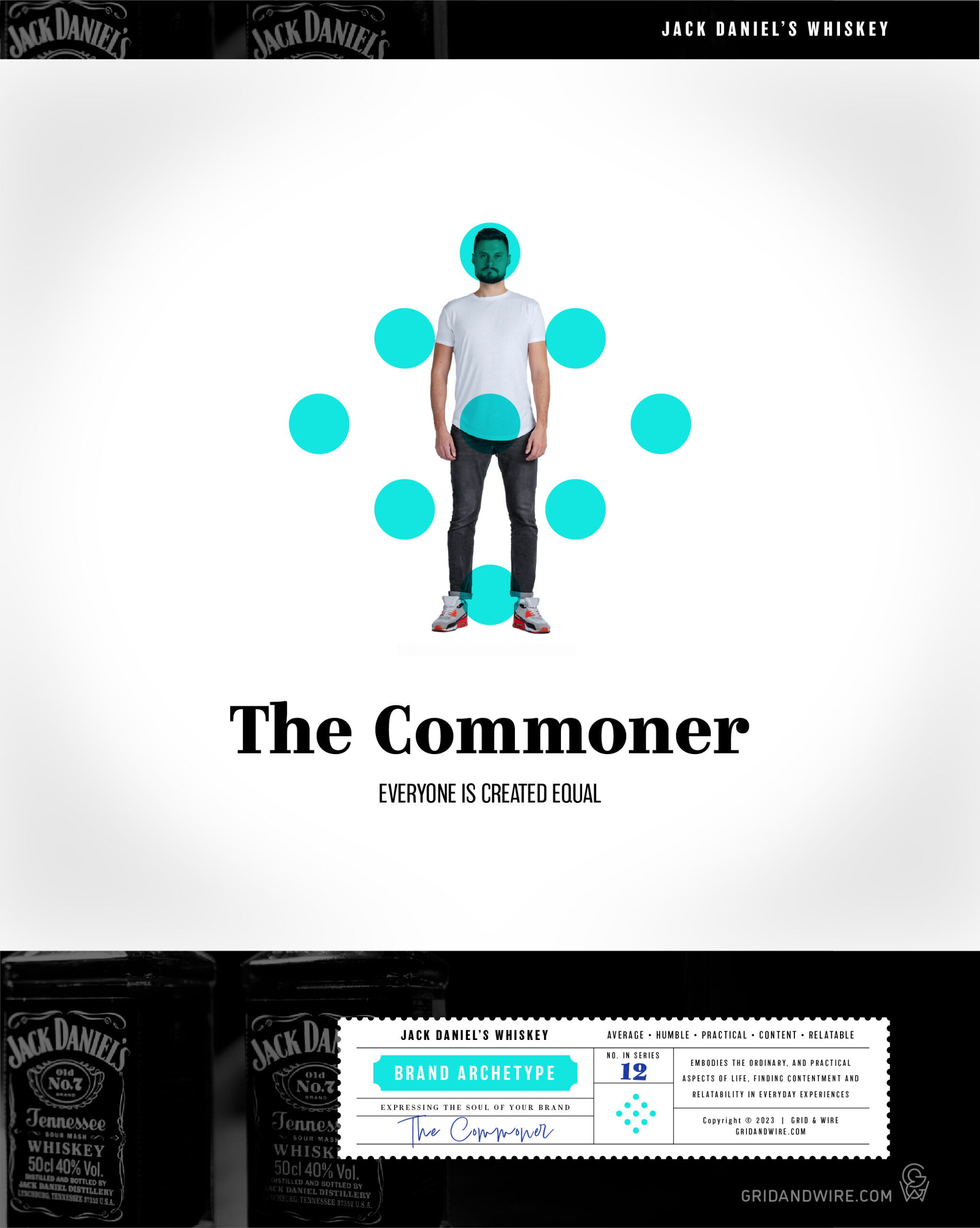
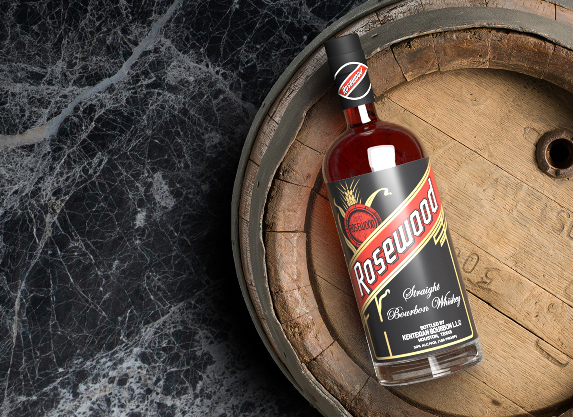
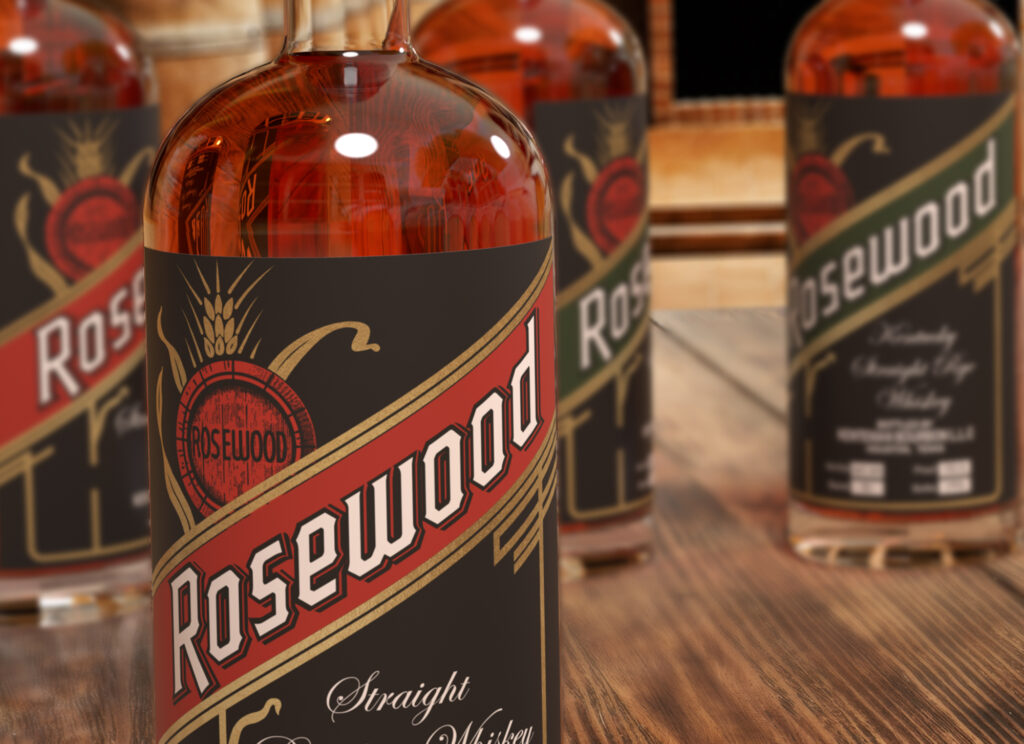
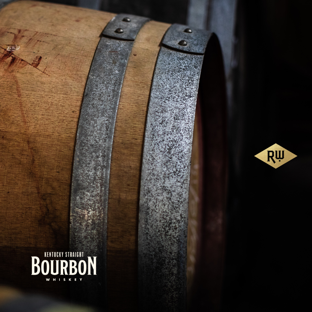
From Carl Jung’s original archetype set, 12 brand archetypes were developed to establish an innately understood and universally recognizable character type that the role of a business brand can embody. Here are visual representations highlighting a famous alcohol brand that falls into each archetype.

Rosewood Bourbon

Bottling a Brand 


Branding & Design

I was approach by the owner of Rosewood Bourbon to get him 10,000 Instagram followers to match his 10,000 Facebook followers. With nothing but a bottle label and a newspaper clipping to go on, I asked him what the Rosewood brand stood for. Jack Daniel’s has the bad boy image, WhistlePig is more tongue-in-cheek and Crown Royal has a regal persona.

I said:

“Before I can create Instagram posts, we need to determine what the Rosewood brand is all about, what you want to say and how you want to say it.”

So we jumped into a brand strategy and landed on a world that embraces hand-crafted sophistication. We positioned the brand as the flashy, bold and a bit boozy after party held in the barn loft out back by the famed enigmatic 1920s literary figure Jay Gatsby.

Based solely on a bottle label that was made in the 1930s, a design system was created encompassing an array of brand assets and graphic elements to be mixed and matched for any application, including those Instagram posts!

Pivotal Digital

Redirecting Law Firms Online


Branding & Design

Pivotal Digital is a digital marketing company that specializes in helping law firms maintain an active online presence. They needed a brand refresh that would be instep with their professional clientele while still delivering a cutting edge feeling that embodies the digital space they live in.

Crane Risk Logic

Raising Crane Safety


Branding & Design

Crane Risk Logic has been collecting data about crane incidents for the past 40 years and they are creating a network for crane companies to use that data to save lives. They seek to challenge the status quo in crane safety and accident cost mitigation through smart technology, data sharing and professional risk management resources.

CRL wanted to market their data infrastructure and mobile application to crane companies nationwide and they needed an integrated campaign to make that happen. Prior to helping build that campaign, I worked with their team to create a brand that would speak to steadiness and strength with a nod to the blue collar nature of their customers. I used a wide typeface to help depict stability and an angular logomark to add an industrial quality.

References

Sadie Strong
OWNER | SAY DELICIOUS

4 years ago I embarked on a new journey of becoming a baker. After perfecting my skillset I began attending markets and having pop up shops. I had no branding or marketing but called my self Sadie-licious. Kevin came in and together we brain stormed ideas of what I envisioned for the brand. He is so knowledgeable not just about design but the function of business as a whole. Being new to this, I changed my mind a lot and was constantly in contact. He is so professional and allowed me to give him all my ideas, hopes, and dreams for the business and turned them into a gorgeous fully functional brand. I completely trusted his input and in no time we had Say Delicious. I now have multiple gorgeous logo variations and designs for marketing. Kevin gave my brand the confidence to grow in ways I never imagined. We are now opening our new storefront this Spring and I couldn’t have done with without Kevin’s help. I highly recommend him for all your business and marketing needs.

Jeff Antkowiak
FOUNDER | ADG CREATIVE

In the digital world where we find ourselves, artists, creatives, and technologist are all necessary to build superior products. Brands would be lucky to find one of those individuals in the mix that is proficient, professional, and demands excellence in every project. With Kevin Pedini, you get all three in one. Kevin has a sensitivity and aesthetic that are rarely found in a technologist (no offense, technologist), and a craftsmanship and keen eye that positions him squarely at the intersection of form & function. Each of my projects with Kevin have been remarkably successful, and I’ve been grateful to have him as a partner in the process when we’ve engage. Thanks for being the guy that you are Kevin. You’re the consummate communications professional and a stellar human being as well.

TJ Mullen
PRESIDENT | BEST MANAGEMENT PRODUCTS

I could not recommend Kevin more highly — he’s always responsive, reliable, and flexible to meet our needs. We especially appreciate his creative approach that uncover more potential in our web sites than we knew was possible. I’ve worked with him on many projects over the years and they’ve all gone smoothly, according to plan and continue to exceed expectations.

Bryan W. Lawson
OWNER | PIVOTAL DIGITAL

I have had only positive experiences working with Kevin. He’s provided professional designs, quality development and great insights when we’ve needed help on more technical matters. But what I like best is his positive attitude when a project might take an unexpected turn or hit a bump in the road. I’ve always felt like we are on the same team with him.

Advisor Cannabis Care

Guiding Patients to Relief


Branding & Design

Advisor Cannabis Care needed a way to gain more visibility in the market and position their simple, 3 step service as the region’s go-to provider. Customers come to them to solve 2 problems: One, counsel them on cannabis pain relief options and two, take them through the steps required to get certified for a medical cannabis card.

Since guiding customers to pain relief and certification was their purpose, it seemed logical to incorporate a compass into their logomark.

I created lead generators in the form of brochures and infographics to help educate customers about medical cannabis and pain relief. These will help capture email leads for helpful correspondence and position Advisor Cannabis Care as the authority when customers are ready to buy.

Crane Risk Logic

Raising Crane Safety


Branding & Design

Crane Risk Logic has been collecting data about crane incidents for the past 40 years and they are creating a network for crane companies to use that data to save lives. They seek to challenge the status quo in crane safety and accident cost mitigation through smart technology, data sharing and professional risk management resources.

CRL wanted to market their data infrastructure and mobile application to crane companies nationwide and they needed an integrated campaign to make that happen. Prior to helping build that campaign, I worked with their team to create a brand that would speak to steadiness and strength with a nod to the blue collar nature of their customers. I used a wide typeface to help depict stability and an angular logomark to add an industrial quality.

Welcome!

I am a designer, developer and animator with a passion for creating engaging digital experiences. With expertise in branding, motion graphics and WordPress development, I bring a unique blend of creativity and technical skill to every project I work on.

Poke around my portfolio to see examples of my work and feel free to reach out if you have any burning questions: kevin@pedini.com.

(P.S. I’m also a solo acoustic performer available for hire!)

Branding

CallTrackingMetrics

Making Values Visual 


Concept, Copywriting & Design

When CallTrackingMetrics embarked on updating their core values, they wanted a fun and engaging way to get them communicated within their company walls. They also wanted memorable visuals so they would be easy to recall by everyone in the company.

I embarked on an exploratory creative process were I joined familiar sayings, pop culture references and amusing turns of phrase with engaging graphics to help reinforce their four new values. I worked on creating three different groupings that could each live as one unit of posters or framed art. From there I broke the graphics out and placed them on different pieces of collateral to adorn desks, cabinets, notebooks and laptop covers.

Now when employees need to call up what CTM stands for they can think of Freddie Mercury to remember how they’re champions of innovation, a VW microbus to recall their commitment to community, a superhero to power their purposeful work ethic or a smiley face to remind them how to treat their customers.

Grid & Wire

Branding & Marketing Company


Branding & Design

Grid & Wire is the professional service company that I operate under. It promotes my work in the branding and marketing spaces and promotes a SaaS product called LeadWire that is an all-in-one digital marketing management platform.

Motoclean Car Detailing

Fresh and Clean Details


Branding & Design

Motoclean Car Detailing is a concept brand that homes in on the fresh and clean expression radiating from the shock royal-blue and stark-white color combo, and runs at it—full speed! The logomark depicts both their mobile convenience and spotless purity like a refreshing raindrop that cleans and revitalizes a car’s surface for those busy folks on the go. The branding tries to capture their dedication to delivering exceptional services with professionalism, reliability, and an unwavering attention to cleanliness and detail.

Digital Draft

Branding a No-Go Event


Branding & Design

Just before the pandemic, CallTrackingMetrics was planning a live event to bring together industry leaders to talk about call tracking and marketing. Unfortunately, all plans were scrapped once live events were shut down in 2020. But, the initiative yielded some interesting brand elements and designs.

CheerKeeper

Plan Your Competition Routine


Branding & UI/UX Design

CheerKeeper is a mobile app that was developed by my wife and me to help better organize performance schedules for our daughter’s cheerleading competitions. At the typical cheer meet, participants and family members download, print out and highlight a program to know where and when each team is to perform. Doing this week after week became cumbersome, confusing and time-consuming. We knew there had to be a better way, so we created CheerKeeper.

With CheerKeeper, you can find competitions before game day by location, date, brand and program and then save details and schedules to your personal events list. You can also identify performance times by level, division or program and quickly scan the details. To keep on top of things during the meet, it allows you to set trigger notifications for select performances and set the times you want to be notified. Crowd-sourced updates will modify the schedule if performances are scratched or times are changed.

For the CheerKeeper brand, I built out a vibe that speaks to the high energy, confident world of competitive cheerleading. It maintains a sense of precision that is innate within a champion cheer performance and organization that is central to the CheerKeeper app’s appeal.

Say Delicious

Reimagining the Cookie Baker


Branding & Design

In a world where every other custom cookie company is steeped in pastels and whimsy, Say Delicious wanted to stand out as the bakery with an edge. With a physical storefront on the horizon, they needed an identity system that could work across diverse mediums: business cards, lapel pins, aprons, watermarks, ingredient labels, plastic cups, an e-commerce website and a host of other placements that can dot a click and mortar landscape.

With the must haves being the incorporation of an octopus character and the use of a steampunk aesthetic, I created a few identifiable marks that could be mixed and matched subject to context.

This allowed Say Delicious to put a full name version with flourishes and a mascot on their storefront sign or a tiny “SAYd” word mark in tighter settings. They also needed a website to sell and ship their product so a Shopify site was created and themed to match the new look and feel.

Say Delicious has grown from baking in a cramped single oven home kitchen to the build out of a stylized storefront with full commercial ovens. And their online store allows them to quickly spin up seasonal products to sell and ship across the US.

Logo Collection

A Recent Retrospective


Design

A handful of recent logos created for clients both real and imaginary.

This is an example page. It’s different from a blog post because it will stay in one place and will show up in your site navigation (in most themes). Most people start with an About page that introduces them to potential site visitors. It might say something like this:

Hi there! I’m a bike messenger by day, aspiring actor by night, and this is my website. I live in Los Angeles, have a great dog named Jack, and I like piña coladas. (And gettin’ caught in the rain.)

…or something like this:

The XYZ Doohickey Company was founded in 1971, and has been providing quality doohickeys to the public ever since. Located in Gotham City, XYZ employs over 2,000 people and does all kinds of awesome things for the Gotham community.

As a new WordPress user, you should go to your dashboard to delete this page and create new pages for your content. Have fun!